
Classificação


Popular Content
Showing content with the highest reputation on 02/06/25 in Tópicos
-
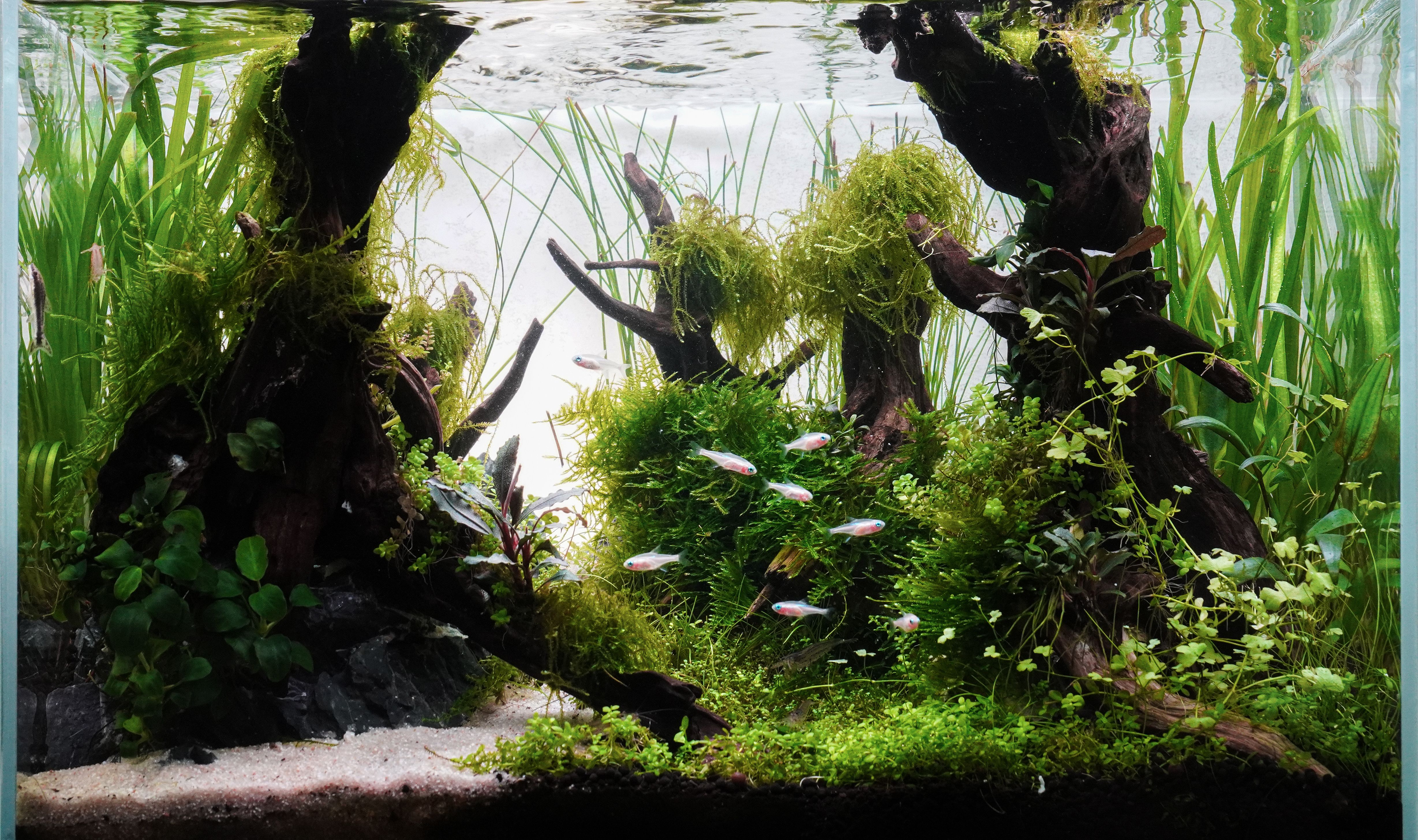
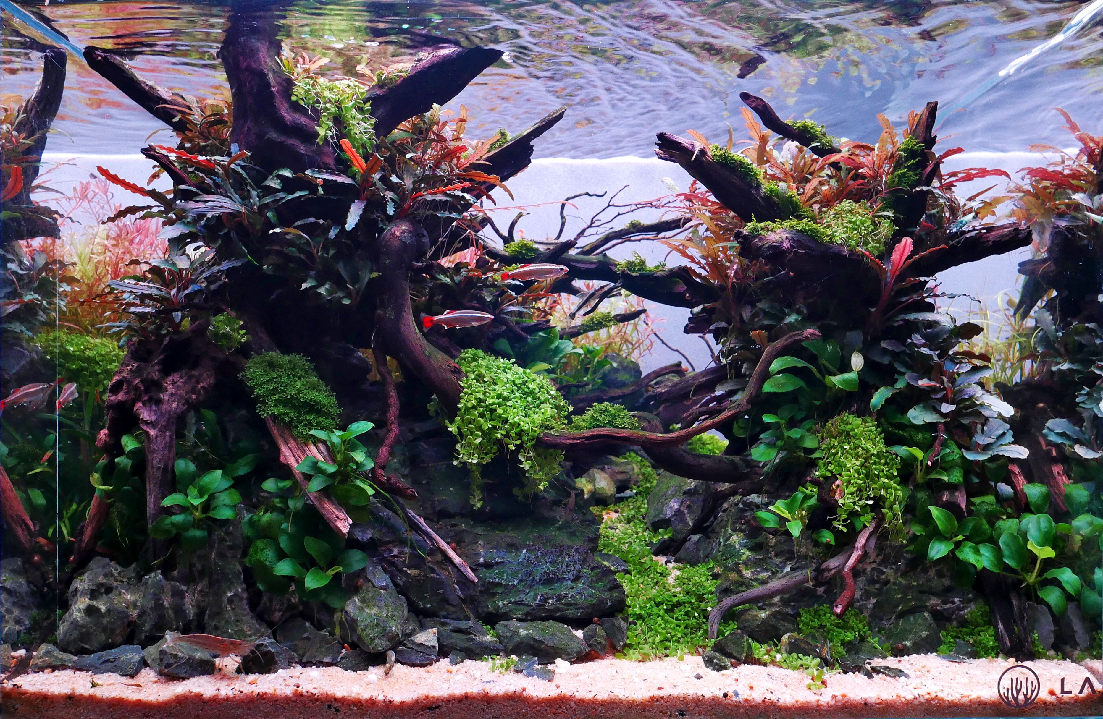
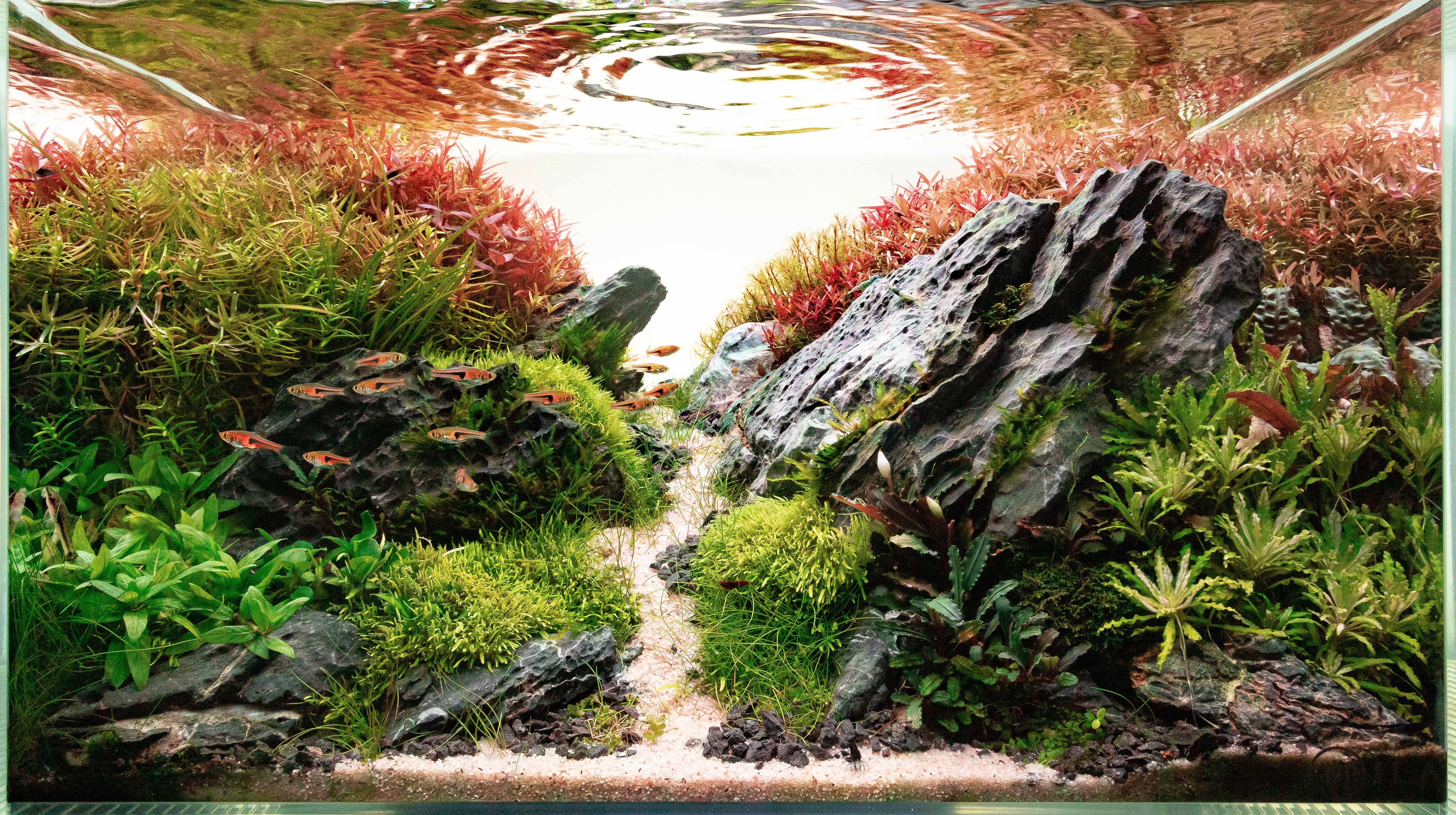
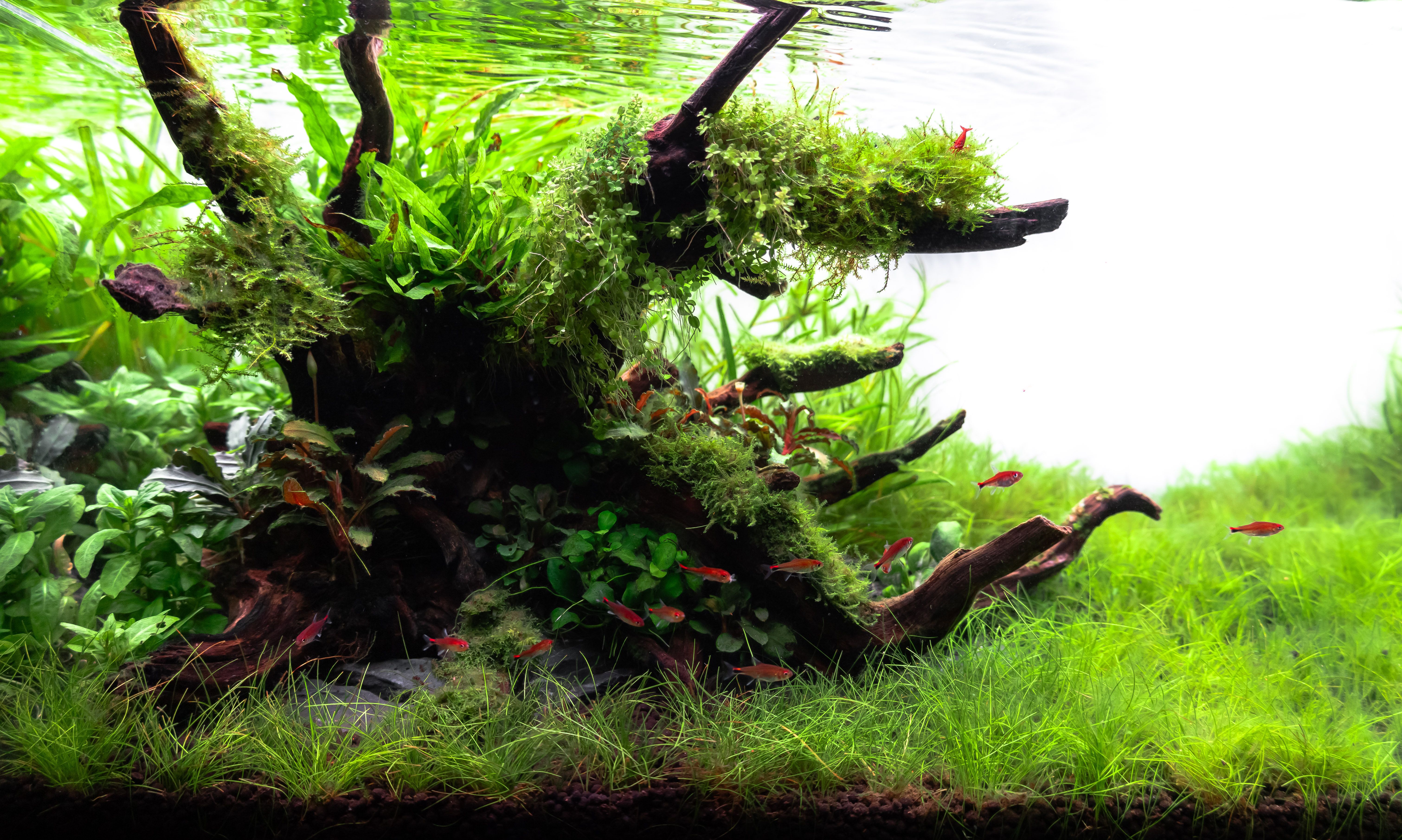
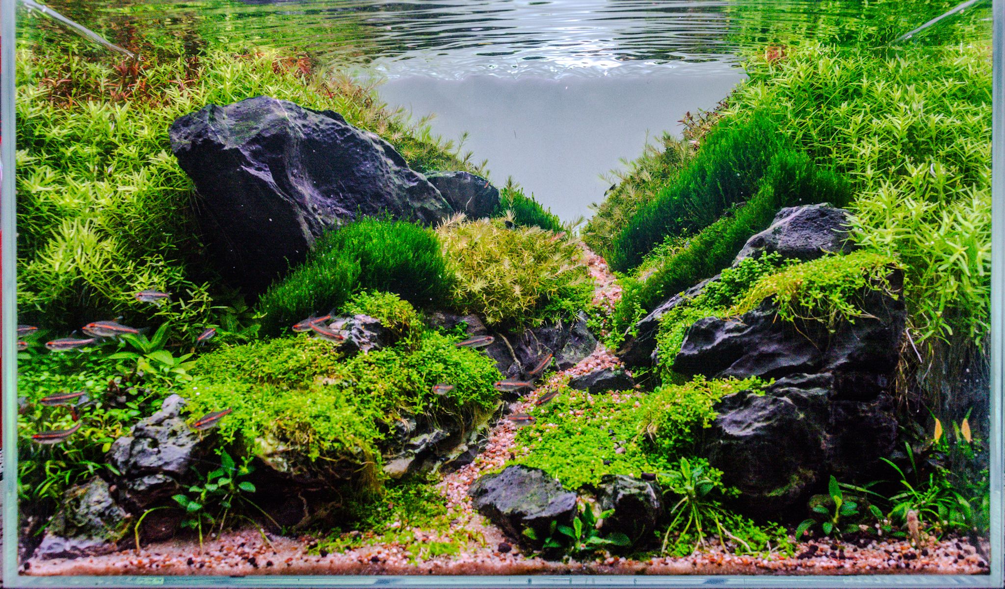
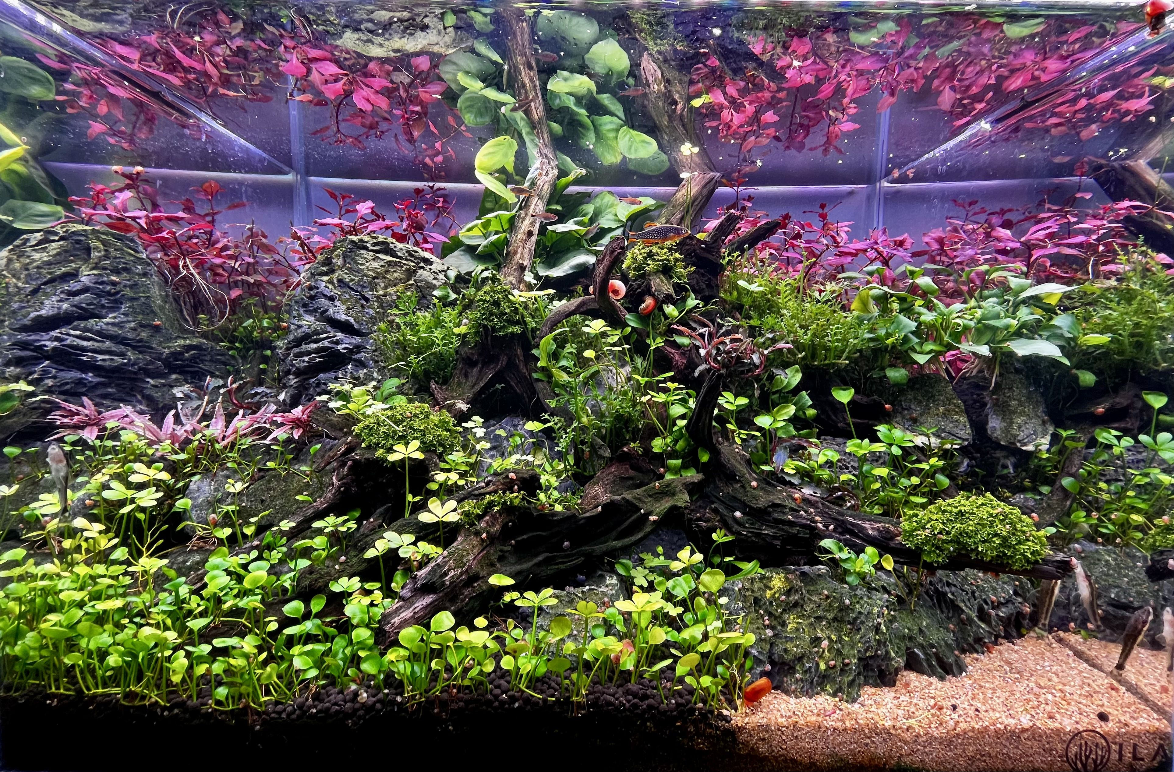
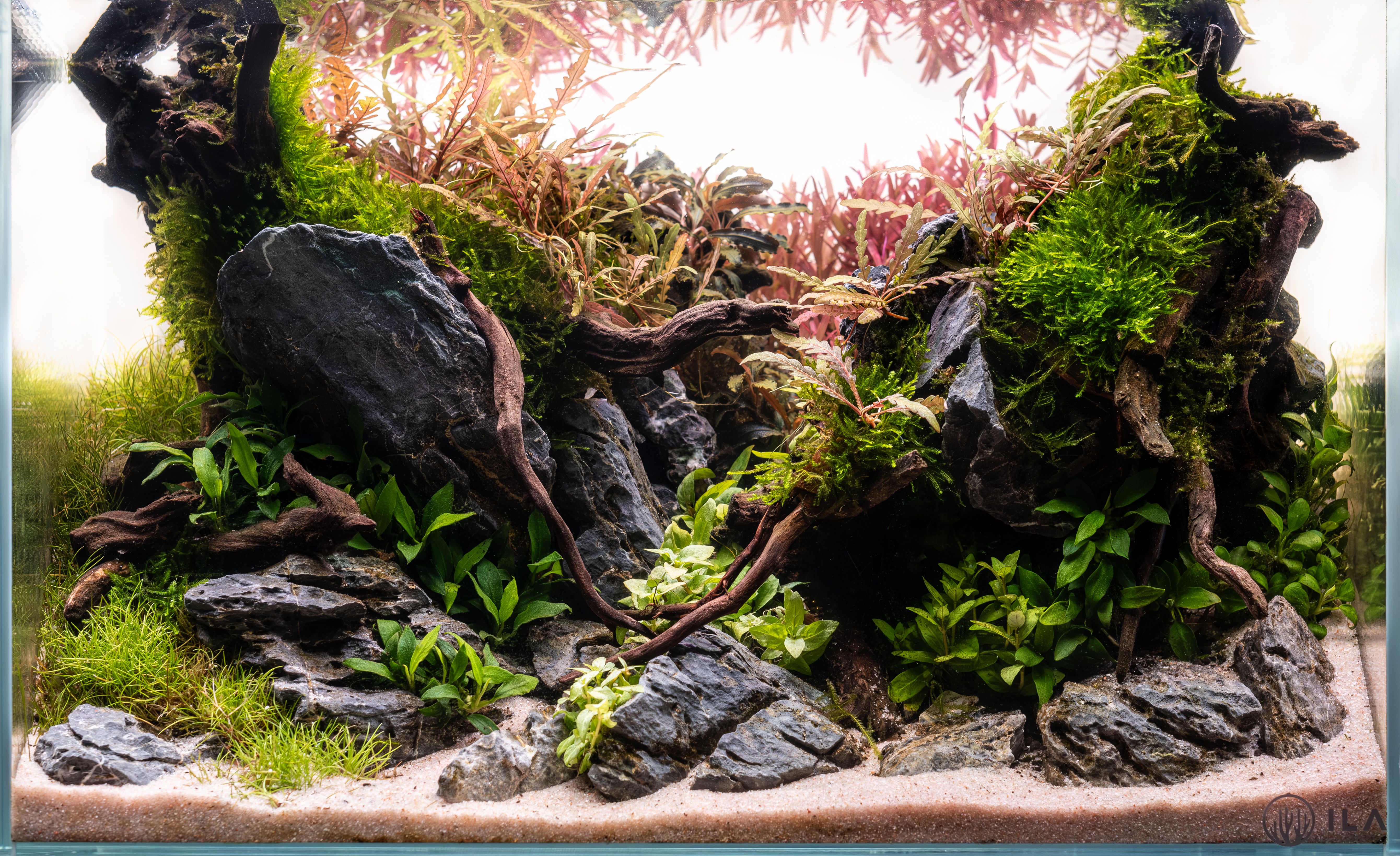
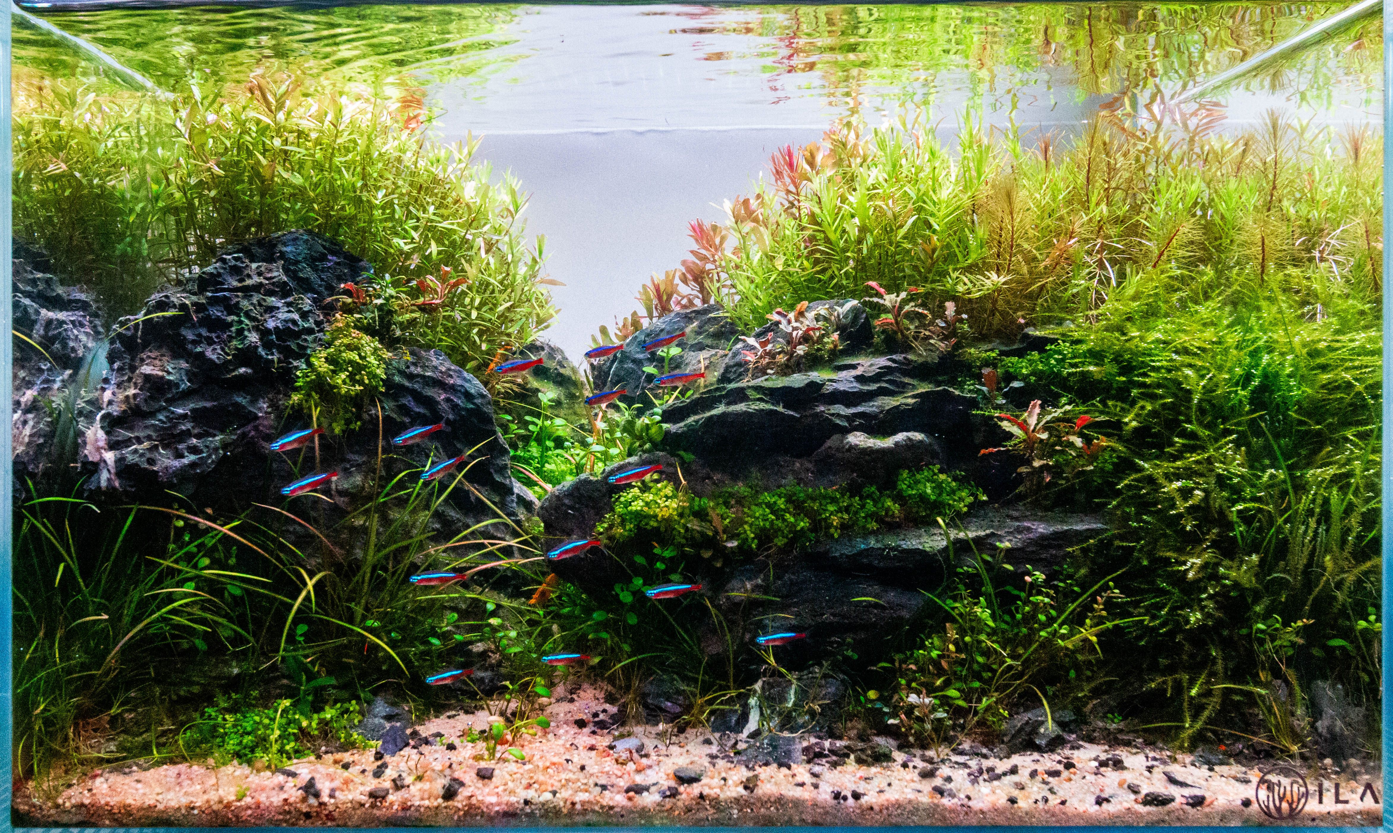
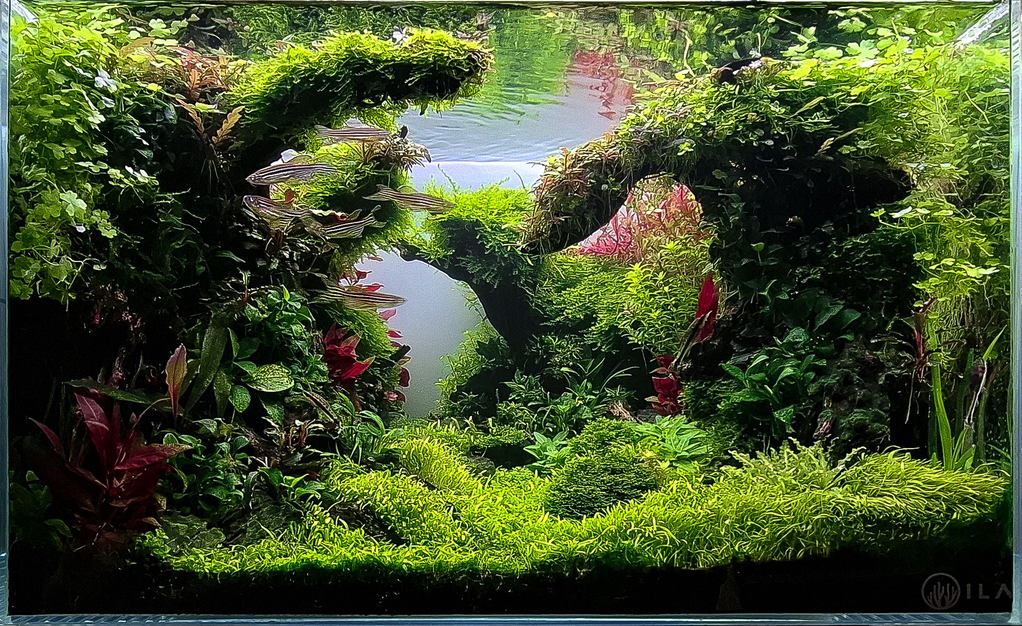
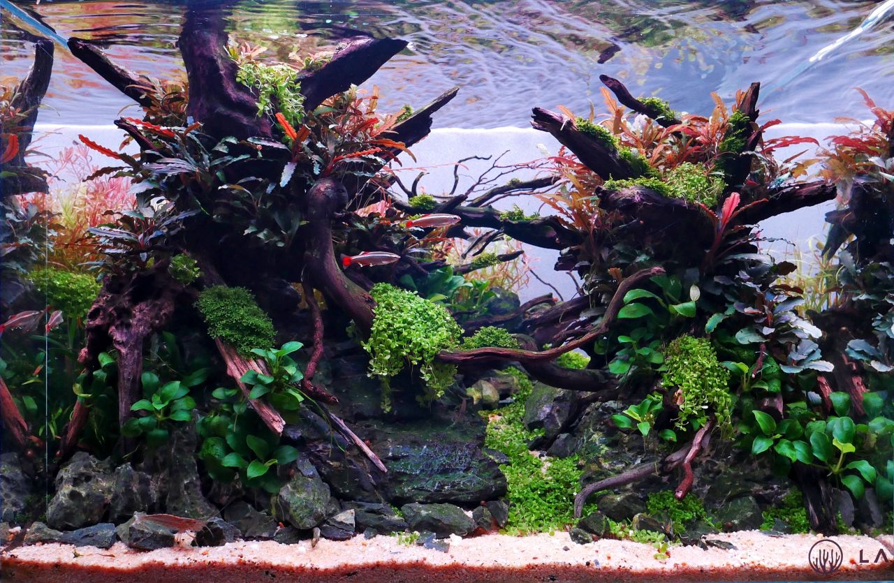
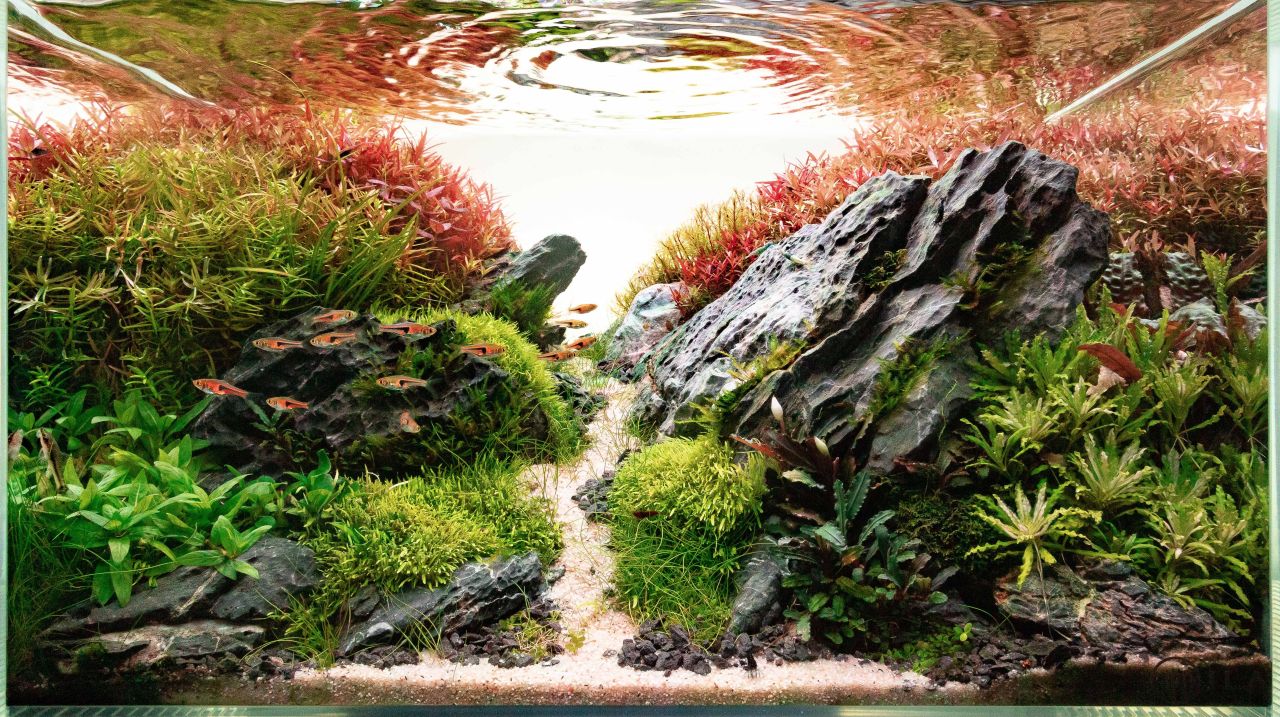
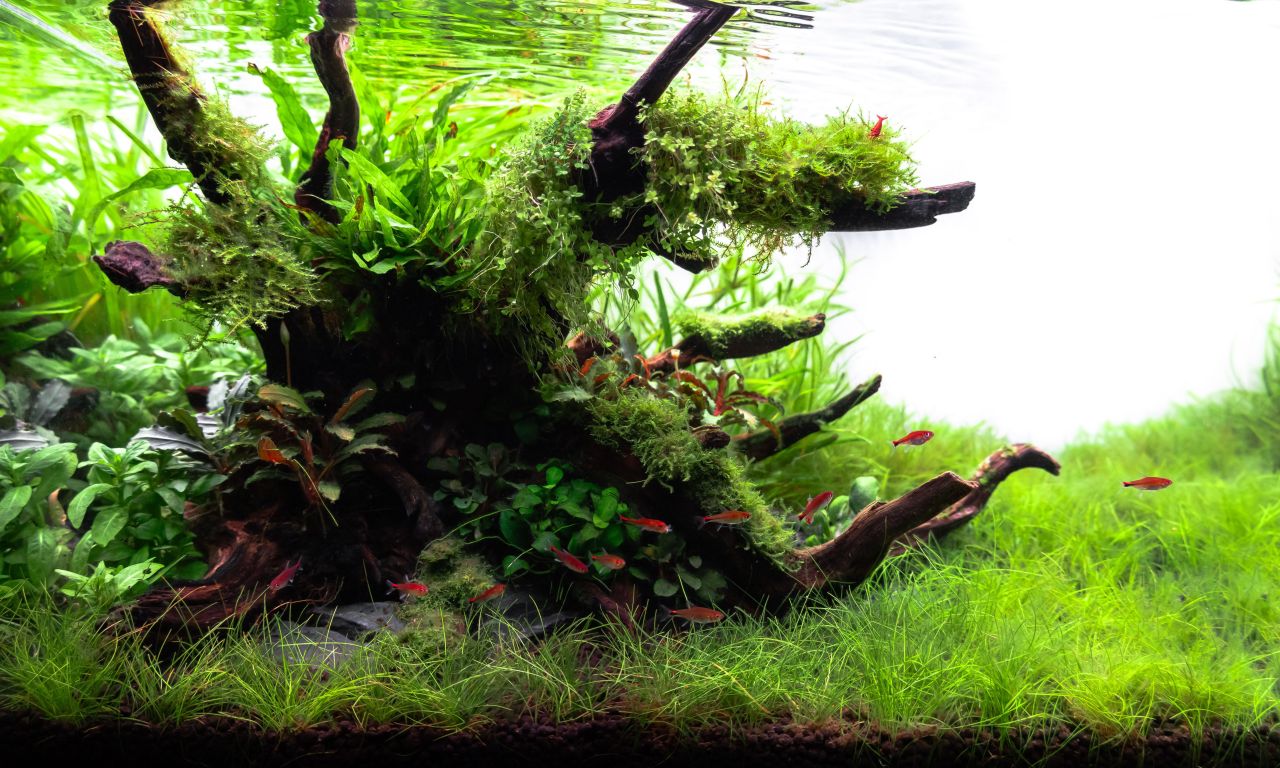
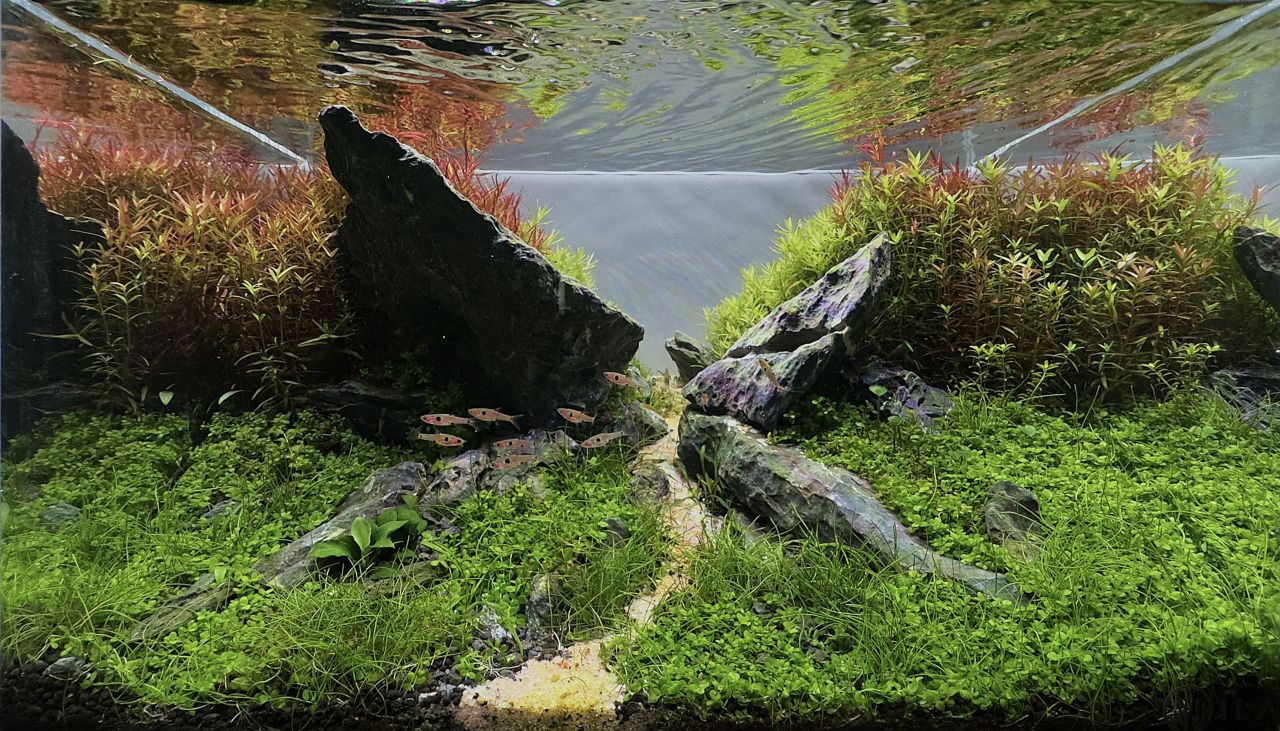
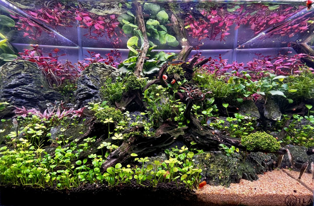
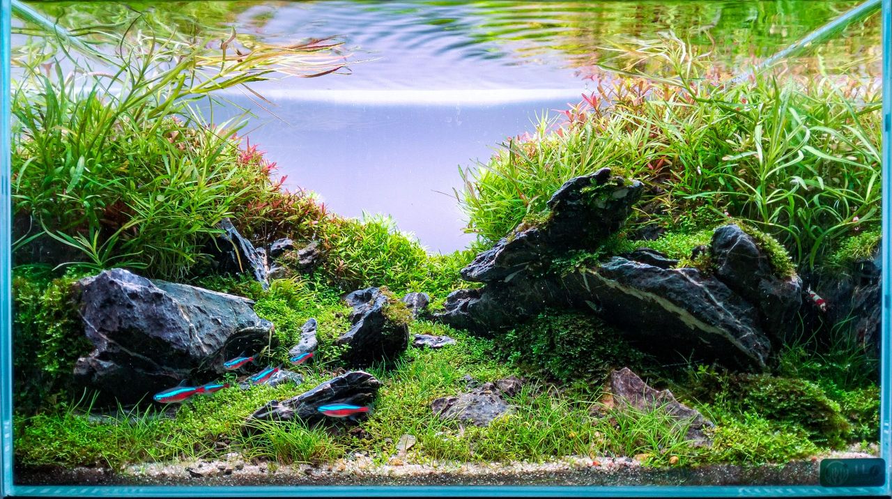
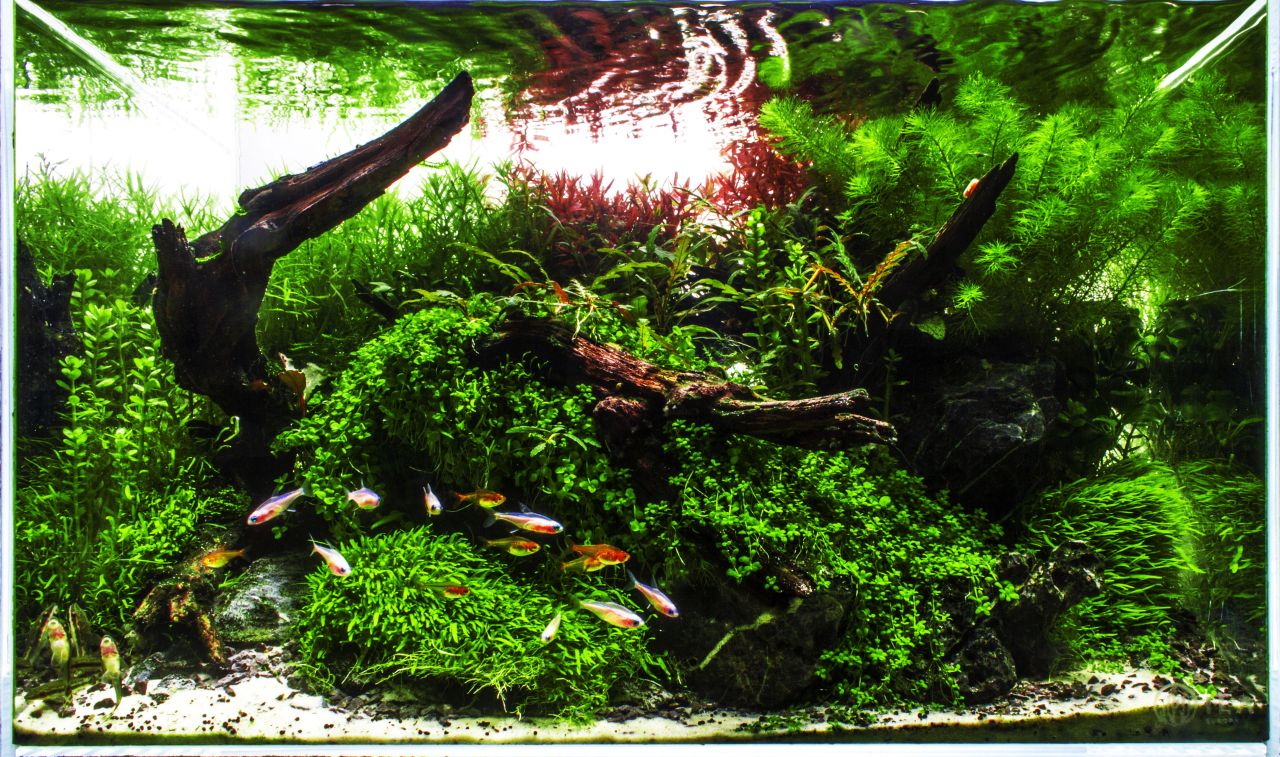
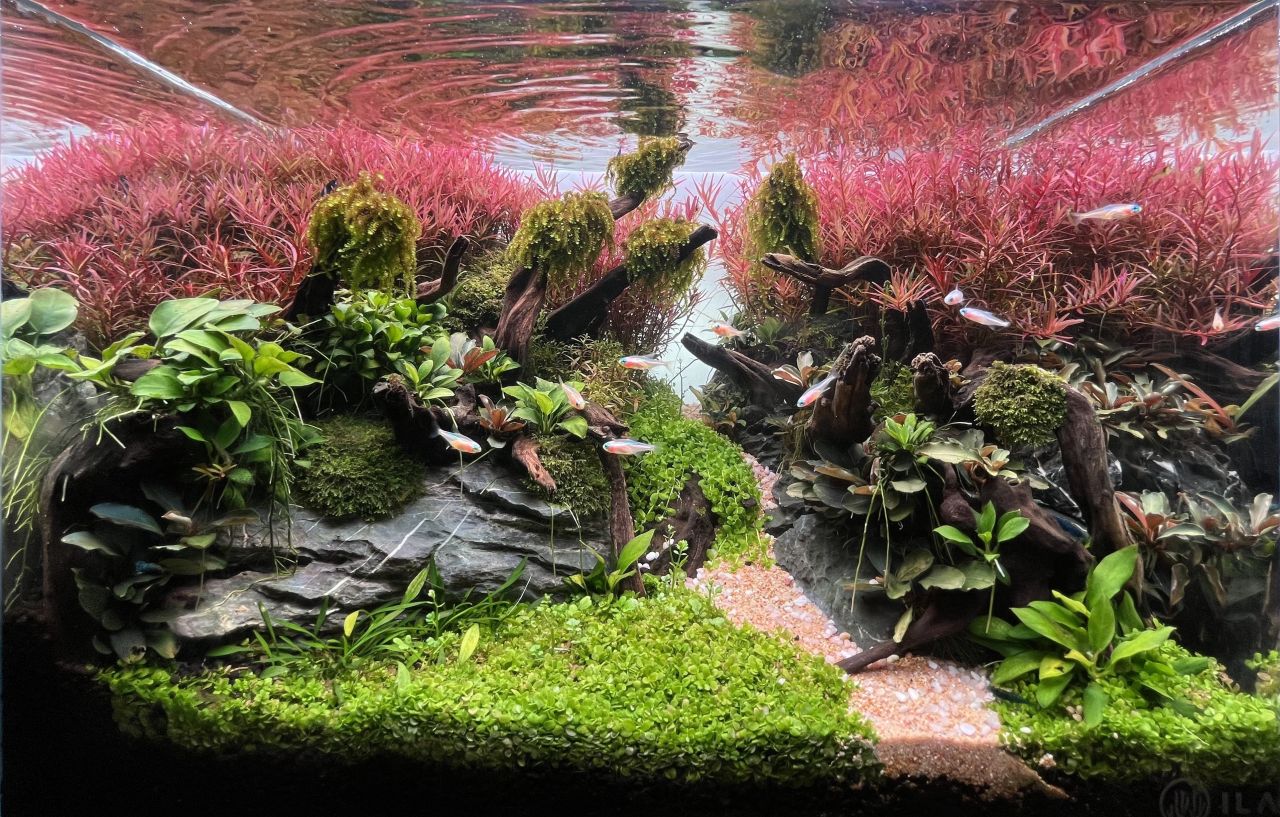
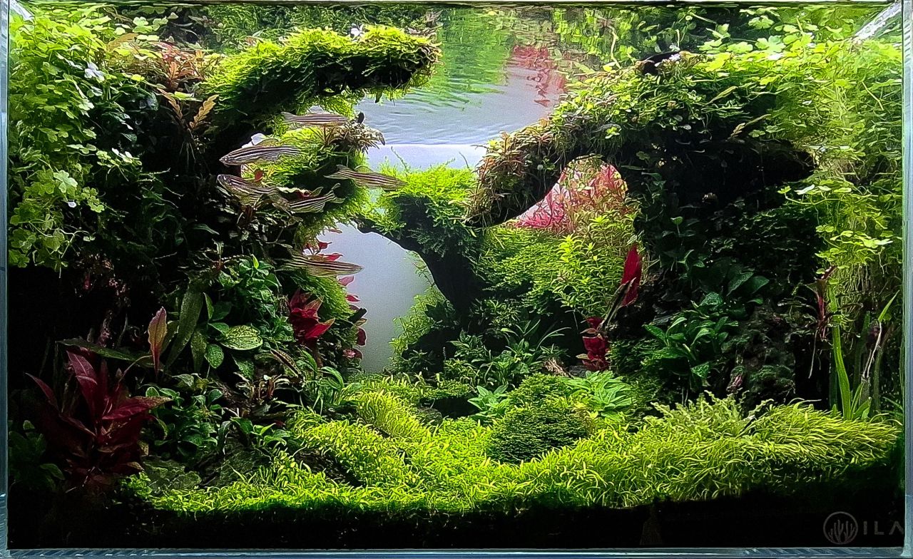
Eis as fotos, as avaliações e os comentários dos juízes convidados: @José Pedro 58,8 Esther Mous The plants need more maintenance/trimming. Water level on photo is not straight Herry Rasio Nice design... could use more plant types Jhonny Vanegas like the quality of plants, well developed. I missed the natural feeling, too organized.You have the tecnique of growing plants. Try next time having a end point and adding natural feeling. Good job. Josh Sim Need to improve on plant integration and plaint maintenance. Take out your equipment before taking your final photo – very important – this is a way to show that you respect the contest and the judges. Mike Senske trimming the stem plants and photo after they grow back in will help over all feel @GlazedNature 59,6 Esther Mous This scape is on it's way to become a beautiful natural green oasis. At the moment of the photo however plants were not all-in best shape and condition. Mostly on the foreground. Herry Rasio Great wood work.... Its seems to have a life of its own Jhonny Vanegas like the quality of plants, well developed. I missed the natural feeling, too organized.You have the tecnique of growing plants. Try next time having a end point and adding natural feeling. Good job. Josh Sim A tiny NA classic! The first thing I notice is the blurry effect at the right background. I do not know if this is done on purpose or unintentionally, the short depth of field (using bigger aperture in the camera setting) has created a dreamy effect and it is actually working in favor of this layout. The foreground hairgrass is looking a little unmatured and plant maintenance has to be improved. Mike Senske I like the fish selection , this aquascape needs a little more time and attention to the details @gjsilva 60,4 Esther Mous The use of only green plants is beautiful. I like the natural feeling The layout however needs more time and attention. Herri Rasio Nice design... could use more plant types Jhonny Vanegas I love a complete green aquarium, good wood selection and forest feeling. The mosses needs more detailed trimmed. Josh Sim We usually do not trim/cut montedivensis (I assume) and Vallisneria this way – we either trim the whole leaf or leave it as it is, cutting them in the middle and leaving the cutting mark visible in the photo is just not the right way. Wood arrangement is pretty OK but plants maintenance has to be improved. Mike Senske nice aquascape , this aquascaper will get better with each new layout . I can feel the passion @Fernando Freire 60,6 Esther Mous This design is a bit too 'busy'. Many things to see but not in perfect harmony and shape. Herri Rasio Nice layout plant color Jhonny Vanegas The foreground is not well developed, and the sense of naturality is not present, but the color selection is great. Next time try to have more perspective and more presence of wood. Josh Sim Lowering your water level during photo session can give you a fuller and richer content in the final photo, better surface reflection too. Having a small triangular sand foreground like this is a big “no” from me – you either have a full sand foreground or fully carpeted foreground without sand. Mike Senske Nice use of color @Ricardo Correia Nature Art 64,8 Esther Mous Artistic but missing a natural feeling. Maybe in time when parts of the wood and rocks are covered in green moss it will look more natural Herri Rasio Nice sense of flow to this layout well done! Jhonny Vanegas The foreground is too straight and the second layer too. It makes the aquarium too dense and flat. But the plant selection, colors and quality are amazing. Love it Josh Sim Using big amount of bucephalandra and anubias is a not a wise decision for a small tank. These 2 plants has “rigid” leaves and it will make your layout looking stiff and artificial. Mike Senske I like the feel and colors of this aquascape , needs some attention to depth perception @Tozé Nunes 69,4 Esther Mous The picture is too bright. The use of plants is nice but the shape is not balanced, it's a bit hard to recognize the shape of the layout. Herri Rasio Great wood work.... Its seems to have a life of its own... I'm captivated Great work! Jhonny Vanegas it is a strong layout, strong colors and it shows technique growing plants. A little suggestion is try to use more reddish plants to balance the scape. My eyes are traped by the red focal point in the back. Well done Josh Sim Over edited. Go easy on your saturation and contrast adjustment. Scape wise, I do not know if this is a triangular composition – and if a judge do not understand what you are trying to do, it is harder to get higher point. Mike Senske healthy plant and I like the selection . The ottos photo bomb the picture LOL @Kire Hajba 76,4 Esther Mous It's nice to see something very different but I think this scape needs more time. Moss to cover the branches and some shrimp or fish to make it come to life. Herri Rasio Good attention to detail and scale Jhonny Vanegas 🥇 For my taste is a good layout, but i would prefer more presence of wood that way will be more balanced. the plants are healthy, the selection of colors are perfect. All the elements together makes this aquarium with a natural atmosphere Josh Sim The layout is looking too squarish and symmetrical. Where are the fish? Mike Senske 🥇very nice , attention to detail is on point , innovative layout , love the rock and wood @Aqua Inn 76,6 Esther Mous Very impressive rock. The grey background color makes the look a tiny bit 'dull'. The gravel path is a bit dirty in the front. Herri Rasio Nice design... could use more plant types Jhonny Vanegas I lost the sense of depth having the rock far from the front. Besides that i like the plant selection and the natural feeling in the back. Good work Josh Sim A very dramatic and futuristic looking layout. The bold selection and arrangement of rock is quite commendable – but I think there are too many “lines” being created in this layout and these “lines” are making this layout look unnatural and too “hard”, usually aquatic plants has the effect of softening our hardscape but not in this case. Perhaps some moss on the rock could achieve this softening effect. Mike Senske I like the bold rock work , the left rock needs a compliment stone behind it to create more depth @Carlos Carvalheira 77,2 Esther Mous The red plants are a bit overwhelming, the need a better more 'open' design line. There seems to be a bit algae between the Anubias roots on the left, better remove that before taking a contest photo. Herri Rasio Nice layout plant color and recovery Jhonny Vanegas colorful layout, good quality of plants, I would love to have more perspective but in overall it is a good scape. Josh Sim The anubias are probably too big for this layout and the red plants are looking too overpowering and monotonous. Plant integration has to be improved – currently the plants look like they exist individually. Mike Senske very nice original first impression , adding a few other stems to the back would create contrast and depth @Vera Santos 78,6 Esther Mous Nice and natural. Stem plants on the back would look better when they would be a bit shorter. Herri Rasio Nice design... could use more plant types Jhonny Vanegas It is a good layout but too dense. The use of plants was appropiated. The background is nice but could be even better doing a detailed trim in the back. Nice work. Josh SimI am happy to see that the creator did not put a path – I think this execution is way better, filling up the “path” with plants. Background stem plant management has to be improved. Small black pebbles at the foreground look like spilled soil. If we want to use small pebble to decorate the foreground, we have to make sure they are all closer to the hardscape and not scattered around the sand Mike Senske very nice nature scape , plant health could be better @Vasco Ferreira 85,4 Esther Mous🥉 Plants are lush and the choice of plants is very nice. A not so common layout and nice fish Herri Rasio Nice design... could use more plant types Jhonny Vanegas the use of wood was good, but the use of plants in excess cover the beautifulness of the wood. I like the quality of the plants but for my taste i preffer less plants species. Sometimes the less the better. Josh Sim I love the brave fish choice! Zebra Danio is usually not advisable as show fish for contest photo because they will look messy and they are not schooling fish. Plants selection is very good and the shadows in this layout are very effective and beautiful. However, in your case, although they are not schooling, but they made this layout look very interesting. Photograph quality and editing process (too much) could be better. Mike Senske 🥈great use of shadows and depth for a small aquarium , nice work @Filipe Serrenho 89 Esther Mous A very natural feeling. Well done! Herri Rasio🥉 The stone selection is unique and wonderfully complemented by the green plant choices. Jhonny Vanegas🥉 The use of small rocks in this layout are delicate.The quality of the plants are really good. For next time you coul trim more that way we can have a relaxing view. Good scape. Keep scaping. Josh Sim 🥇The mixture and integration of plants are executed perfectly. The combination of HC Cuba and mini hairgrass foreground is my favorite combination and I am happy to see it in this layout. The use of the tall stem plants at the left and right side adds a wild and water flowing effect which I love very much. Red plants are being used subtly but brilliantly, this is the right way to integrate red plants in a layout – just enough to feel its presence without overpowering the whole layout. Mike Senske 🥉lovely nature scape feeling @Bruno R. Carvalho 89 Esther Mous 🥇 I'm in love with the mix of green. It's a pity the fish seem a bit lost on the left. Herri Rasio🥈 Great plant growth, love the layers! Jhonny Vanegas 🥇 The use of small rocks in this layout are delicate.The quality of the plants are really good. For next time you coul trim more that way we can have a relaxing view. Good scape. Keep scaping. Josh Sim 🥉A beautiful and well balanced layout affected by 2 aspects: The photograph is poor quality and the fish are in disarray! The photo is looking very dull and lack of energy, the greyish background further compounded the problem and give a very gloomy impression. All this has made this nice layout look very flat and undesirable. We do not need a prefect schooling fish but at least choose a photo that has decent schooling fish, or if we cannot do that, try reducing the number of fish. One more point, the background stem plants (some kind of Mayaca?) is not contributing any positive effect to the final layout, instead, they made this layout look unmatured. Mike Senske amazing scape , A better quality photo would help @Ismael Figueira 90,6 Esther Mous 🥈The condition of the plants is very good and I love the the use of color Herri Rasio🥇 This view is great in terms of planting. I really like the partially exposed rock in the front right. Jhonny Vanegas 🥈Well done. The plants are healthy and i like the use of colors in this layout. It is a zen and relaxing design. Next time try not to put rocks close to the glass, it difficult to keep the area clean. Josh Sim 🥈This is the layout with the best plant condition, best photograph and creating the best mood. I can very well imagine other judges making this layout their favorite. However for me, I deduct some points for 2 reasons: The plants are not balance – plants on the left and right side should always achieve some harmonious effect by having the same plants, in this layout, I see stourogyne on the left and downoi on the right. Ludwigia Acuata on the left and Rotala Wallichi on the right. This is not a good execution The layout is divided too center (50%-50%) and the path is not slant enough. Fix these 2 points, this will be my favorite layout Mike Senske extremely well done , excellent plant health , great attention to detail , good fish selection


 3 points
 -
Boas Muitos parabéns a todos os participantes do 5º desafio de aquascaping, todos os trabalhos estavam muito bons ,e um grande bem haja ao homem do leme o Tozé Nunes,que com muita teimosia mexe ceus e terra para levar este concurso quem sabe um dia a ser internacionalmente conhecido,obrigada. Um Abraço para todos.1 point
-
Sim... percebo o que queres dizer. Mas ainda assim não está perfeita. Vê a fotografia vencedora... e a fotografia do @Kire Hajba. Essas sim, destacam-se. Até a do @JoãogaFernandes e a do @Tozé Nunes, apesar desta última ter uma pós-produção exagerada. O que quero dizer é que, de entre todos, são muito poucos os aquários que ficam a ganhar com a fotografia final, e devia ser exactamente o contrário. Eu compreendo que muita gente não olha para isto como um concurso, e que não se preocupa tanto com a imagem que os membros do júri avaliam, mas no fundo é apenas a essa imagem que eles têm acesso.1 point
-
Eu preciso mesmo, centenas de fotos e acabei com isto. Agora vejam a verdadeira foto final, a do termômetro, sem termômetro cortesia do João Fernandes [emoji24][emoji24][emoji24] Enviado do meu 24040RN64Y através do Tapatalk1 point
-
Este é para mim o melhor prémio de todos. Poder ler os comentários dos mestres aos nossos trabalhos deve ser uma coisa fantástica e, por isso, o @Tozé Nunes está mais uma vez de parabéns - imagino que não seja tarefa fácil chegar a estes nomes e pedir-lhes para comentar todos os aquários 🙂 . Em relação às avaliações haveria muito mais a dizer, mas gostava de destacar a que fizeram ao trabalho do @Kire Hajba, que até leva 2 medalhas de ouro e depois perde tudo pela falta de fauna (porquê Kire???); a que fizeram ao aquário do @Bruno R. Carvalho - para mim o vencedor do concurso... só perde pela fotografia (mais uma vez reforço a ideia de que é preciso dar muita atenção a este assunto); e, claro, a avaliação do tanque do @ismael_figueira que revela a sua experiência muito acima da média neste tipo de competições - é um dos melhores aquários, sim, mas julgo que foi a sua mestria que no momento final lhe valeu o prémio. Tozé, fica aqui a ideia... eu convidava o Ismael a dar um workshop de Fotografia de Aquários no início do próximo desafio 😉 .1 point
-
Podes crer! O Josh e o Mike para mim foram sempre os melhores scapers, e saber que eles avaliam o nosso trabalho e ainda comentam é uma sensação unica! Eu ate andava na duvida se iria participar para o ano, mas com isto já não tenho duvida nenhuma, o Tozé pode contar comigo para o ano [emoji28] Enviado do meu iPhone usando o Tapatalk1 point
-
Parabéns a todos os participantes e obrigado por trazerem até nós, (aqueles que não estiveram presentes no evento), estes magníficos trabalhos, e é sem dúvida muito bom ver as avaliações dadas pelo júri, contribuindo assim para a evolução de todos quantos visitam este forum.1 point
-
O melhor prémio de todos é ler estes comentários!1 point
-
Muitos parabéns a todos. Uma menção à direcção bicéfala do RiverWoods: O bom de estar no fundo é que a partir de agora é sempre a subir. Aprender com as dicas dos juris, não só do v/ mas também dos dos outros participantes. Excelente trabalho de todos!1 point